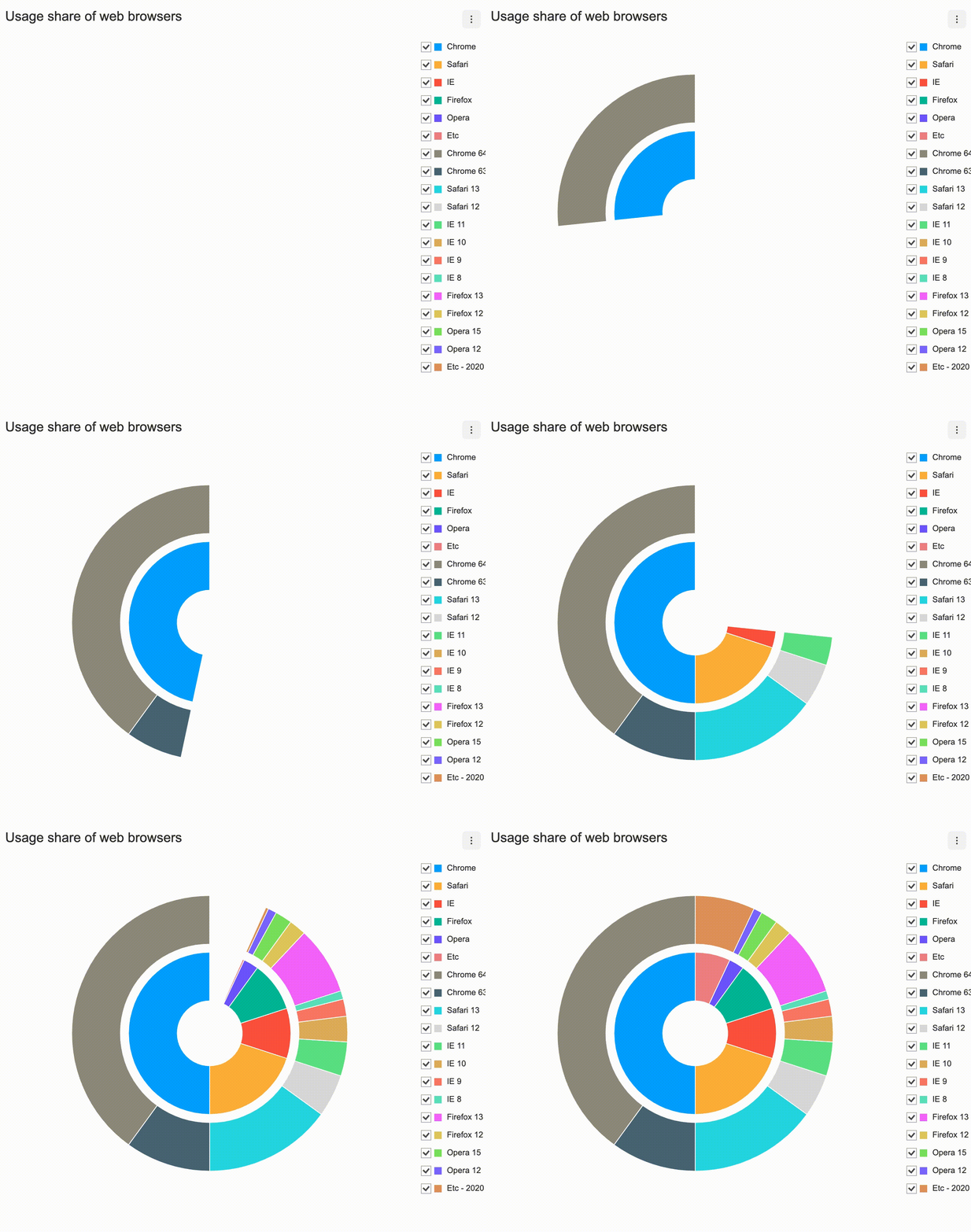
API information regarding each chart is not addressed in this document. Refer to the API Guide.
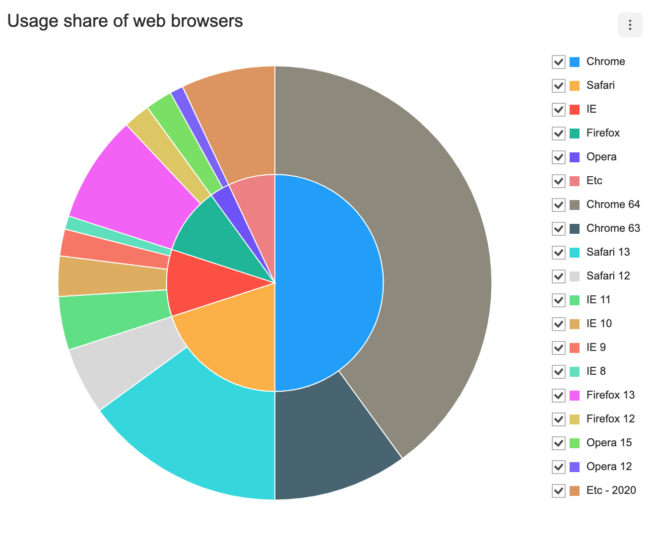
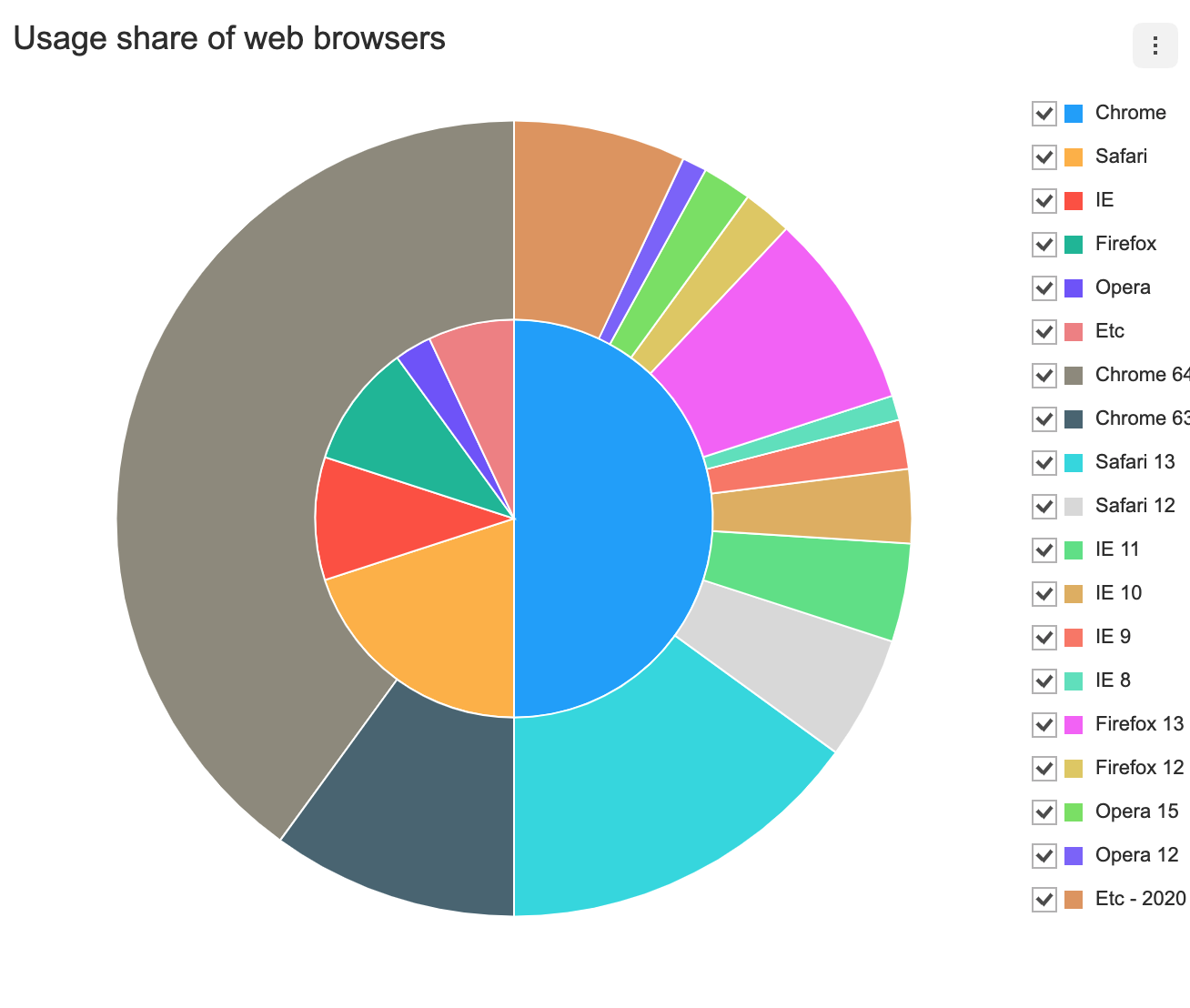
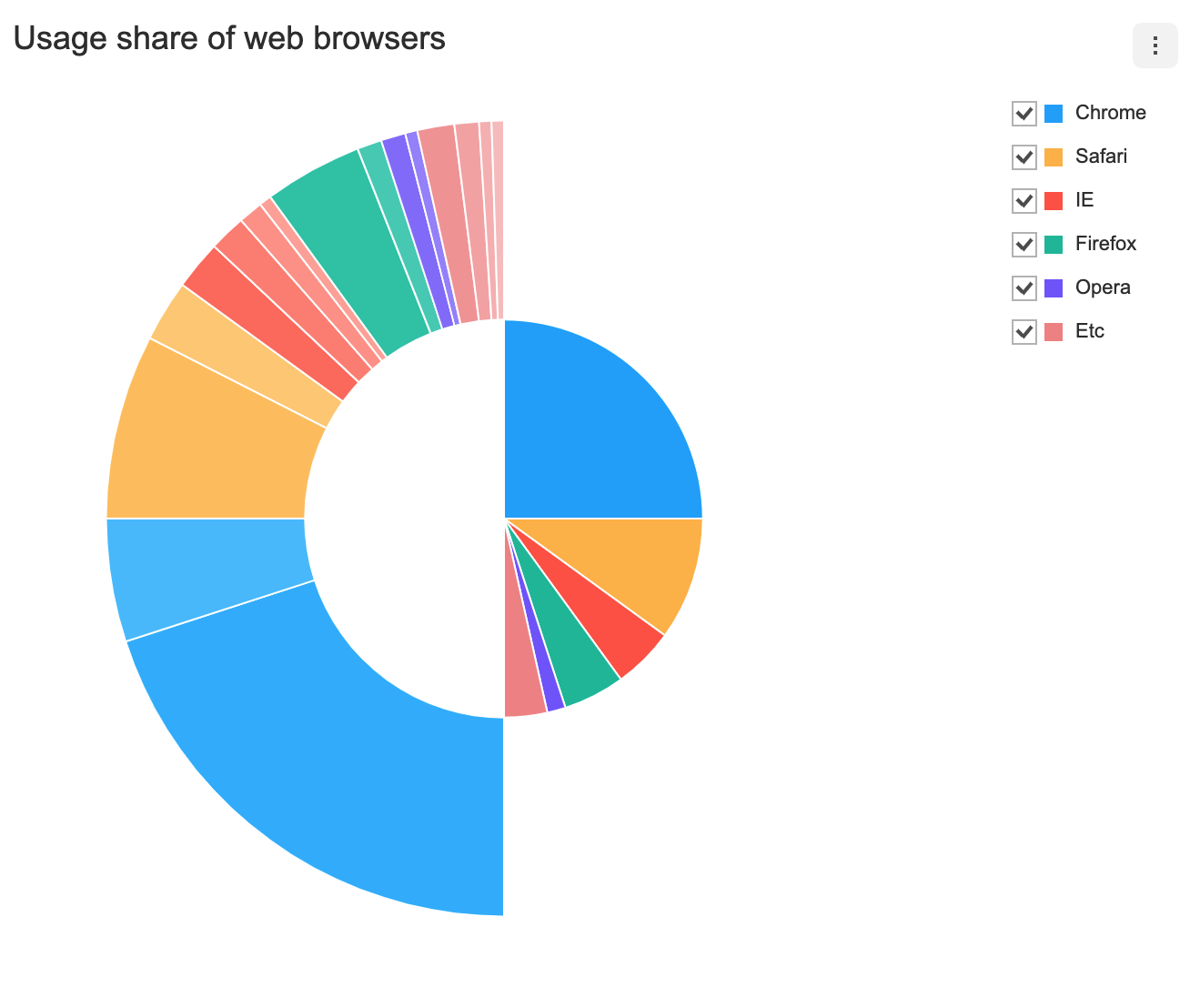
There are two different ways to create the Nested Pie chart. The Nested Pie chart can be created through the constructor function or the static function. The two methods both result in returning an instance of the chart. The HTML element in which the chart is drawn el, data data, and the options object options are taken as parameters. If the element in which the chart is drawn contains elements other than the chart itself, it may unintentionally affect the chart. Therefore, it is recommended that you use an empty HTML element.
import { NestedPieChart } from '@toast-ui/chart';

const chart = new NestedPieChart({el, data, options});

// or

import Chart from '@toast-ui/chart';

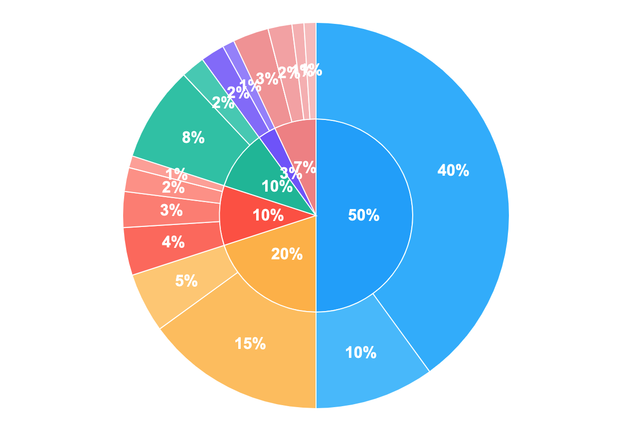
const chart = Chart.nestedPieChart({el, data, options});The data is entered as a series. The nested pie chart takes the nominal name value and the data that represents sectors as data. The data must be a pair of name and data. All values in data are displayed on the legend.
const data = {
  series: [
    {
      name: 'browsers',
      data: [
        {
          name: 'Chrome',
          data: 50,
        },
        {
          name: 'Safari',
          data: 20,
        },
        {
          name: 'IE',
          data: 10,
        },
        {
          name: 'Firefox',
          data: 10,
        },
        {
          name: 'Opera',
          data: 3,
        },
        {
          name: 'Etc',
          data: 7,
        },
      ],
    },
    {
      name: 'versions',
      data: [
        {
          name: 'Chrome 64',
          data: 40,
        },
        {
          name: 'Chrome 63',
          data: 10,
        },
        {
          name: 'Safari 13',
          data: 15,
        },
        {
          name: 'Safari 12',
          data: 5,
        },
        {
          name: 'IE 11',
          data: 4,
        },
        {
          name: 'IE 10',
          data: 3,
        },
        {
          name: 'IE 9',
          data: 2,
        },
        {
          name: 'IE 8',
          data: 1,
        },
        {
          name: 'Firefox 13',
          data: 8,
        },
        {
          name: 'Firefox 12',
          data: 2,
        },
        {
          name: 'Opera 15',
          data: 2,
        },
        {
          name: 'Opera 12',
          data: 1,
        },
        {
          name: 'Etc - 2020',
          data: 7,
        },
      ],
    },
  ]
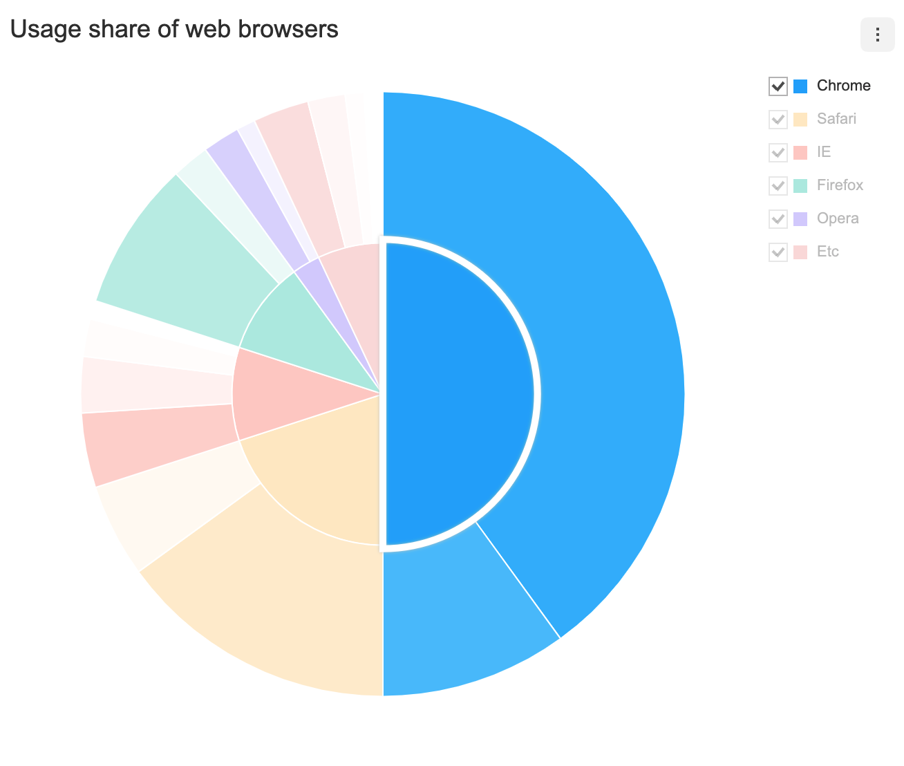
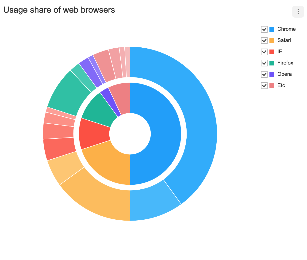
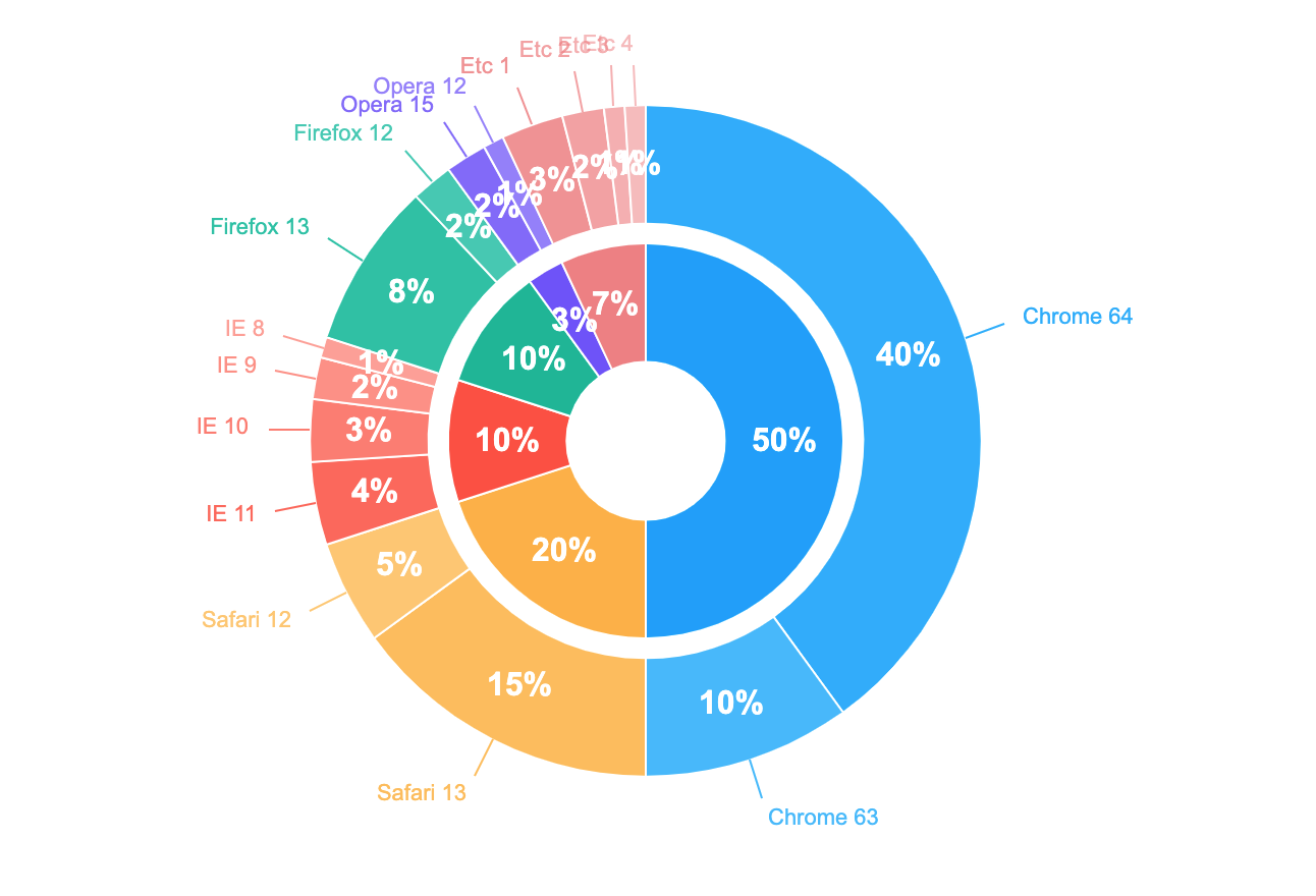
}The parentName can be used to define a data's parent series, which relates the two as a group data. Members of the group data share a same color and are differentiated by opacity. The data value that has the first index in the series is displayed on the legend.
const data = {
  categories: ['A', 'B'],
  series: [
    {
      name: 'browsers',
      data: [
        {
          name: 'Chrome',
          data: 50,
        },
        {
          name: 'Safari',
          data: 20,
        },
        {
          name: 'IE',
          data: 10,
        },
        {
          name: 'Firefox',
          data: 10,
        },
        {
          name: 'Opera',
          data: 3,
        },
        {
          name: 'Etc',
          data: 7,
        },
      ],
    },
    {
      name: 'versions',
      data: [
        {
          name: 'Chrome 64',
          parentName: 'Chrome',
          data: 40,
        },
        {
          name: 'Chrome 63',
          parentName: 'Chrome',
          data: 10,
        },
        {
          name: 'Safari 13',
          parentName: 'Safari',
          data: 15,
        },
        {
          name: 'Safari 12',
          parentName: 'Safari',
          data: 5,
        },
        {
          name: 'IE 11',
          parentName: 'IE',
          data: 4,
        },
        {
          name: 'IE 10',
          parentName: 'IE',
          data: 3,
        },
        {
          name: 'IE 9',
          parentName: 'IE',
          data: 2,
        },
        {
          name: 'IE 8',
          parentName: 'IE',
          data: 1,
        },
        {
          name: 'Firefox 13',
          parentName: 'Firefox',
          data: 8,
        },
        {
          name: 'Firefox 12',
          parentName: 'Firefox',
          data: 2,
        },
        {
          name: 'Opera 15',
          parentName: 'Opera',
          data: 2,
        },
        {
          name: 'Opera 12',
          parentName: 'Opera',
          data: 1,
        },
        {
          name: 'Etc 1',
          parentName: 'Etc',
          data: 3,
        },
        {
          name: 'Etc 2',
          parentName: 'Etc',
          data: 2,
        },
        {
          name: 'Etc 3',
          parentName: 'Etc',
          data: 1,
        },
        {
          name: 'Etc 4',
          parentName: 'Etc',
          data: 1,
        },
      ],
    },
  ],
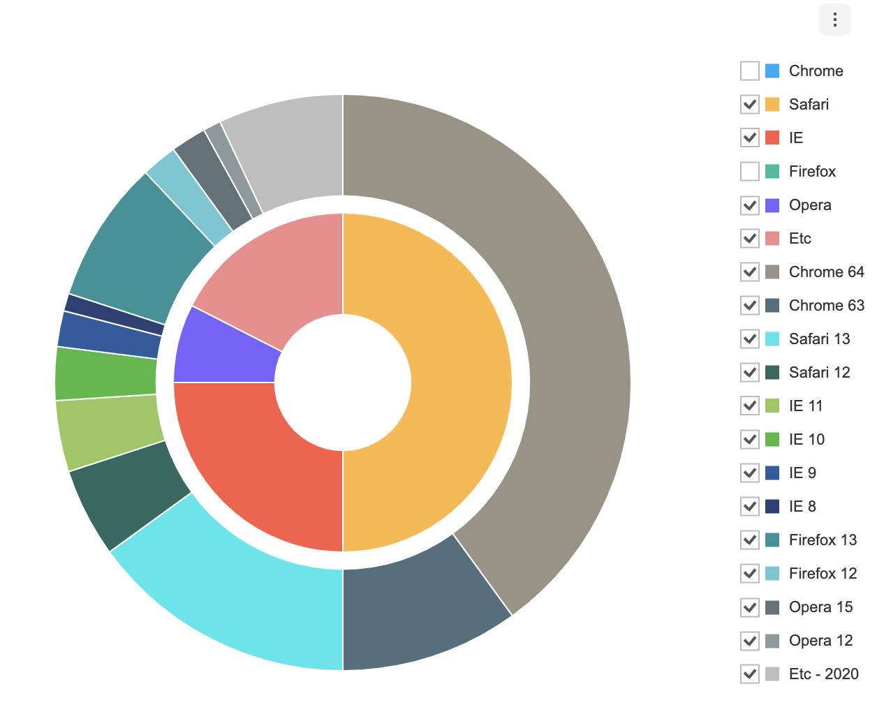
};Each series can have visible option. The visible option determines whether the series is displayed when the chart is first drawn. The default is true.
Both basic chart and group data chart use the same way.
const data = {
  series: [
    {
      name: 'browsers',
      data: [
        {
          name: 'Chrome',
          data: 50,
          visible: false,
        },
        {
          name: 'Safari',
          data: 20,
        },
        {
          name: 'IE',
          data: 10,
        },
        {
          name: 'Firefox',
          data: 10,
          visible: false,
        },
        {
          name: 'Opera',
          data: 3,
        },
        {
          name: 'Etc',
          data: 7,
        },
      ],
    },
    {
      name: 'versions',
      data: [
        {
          name: 'Chrome 64',
          data: 40,
        },
        {
          name: 'Chrome 63',
          data: 10,
        },
        {
          name: 'Safari 13',
          data: 15,
        },
        {
          name: 'Safari 12',
          data: 5,
        },
        {
          name: 'IE 11',
          data: 4,
        },
        {
          name: 'IE 10',
          data: 3,
        },
        {
          name: 'IE 9',
          data: 2,
        },
        {
          name: 'IE 8',
          data: 1,
        },
        {
          name: 'Firefox 13',
          data: 8,
        },
        {
          name: 'Firefox 12',
          data: 2,
        },
        {
          name: 'Opera 15',
          data: 2,
        },
        {
          name: 'Opera 12',
          data: 1,
        },
        {
          name: 'Etc - 2020',
          data: 7,
        },
      ],
    },
  ]
}
If you create a chart by applying the above option, you can see that the checkbox is unchecked.
options should be used as an object. The series option is identical to the series option for the Pie chart, essentially, except for the radiusRange. The Nested Pie uses separate radii range to draw nested series.[name] corresponds to the name of the entered series. Options that must be applied to all nested series are defined directly in series, and options unique to each series are defined in [name].
type options = {
  chart?: {
    //...
  }
  legend?: {
    //...
  }
  exportMenu?: {
    //...
  }
  tooltip?: {
    //...
  }
  responsive?: {
    //...
  }
  theme?: {
    // More explanations in the `theme` chapter.
  }
  series?: {
    selectable?: boolean;
    clockwise?: boolean;
    angleRange?: {
      start?: number;
      end?: number;
    };
    dataLabels?: {
      visible?: boolean;
      anchor?: DataLabelAnchor;
      offsetX?: number;
      offsetY?: number;
      formatter?: (value) => string;
      pieSeriesName?: {
        visible: boolean;
        anchor?: 'center' | 'outer';
      };
    };
    [name]: {
      selectable?: boolean;
      clockwise?: boolean;
      angleRange?: {
        start?: number;
        end?: number;
      };
      radiusRange?: {
        inner?: number | string;
        outer?: number | string;
      };
      dataLabels?: {
        visible?: boolean;
        anchor?: DataLabelAnchor;
        offsetX?: number;
        offsetY?: number;
        formatter?: (value) => string;;
        pieSeriesName?: {
          visible: boolean;
          anchor?: 'center' | 'outer';
        };
      };
    }
  }
}
Common options that can be used with this chart are not addressed in this document. Refer to the respective options guide. (Links:
chartOptions, Legend, Export, Tooltip,responsiveOptions )
Makes the series selectable.
- default:
false
const options = {
  series: {
    selectable: true
  }
};
This option can be assigned to the name of each series. The example below makes the Pie chart that has a name 'browsers' selectable without affecting the Pie chart that has a name versions.
const options = {
  series: {
    browsers: {
      selectable: true
    },
    versions: {
      selectable: false
    }
  }
};
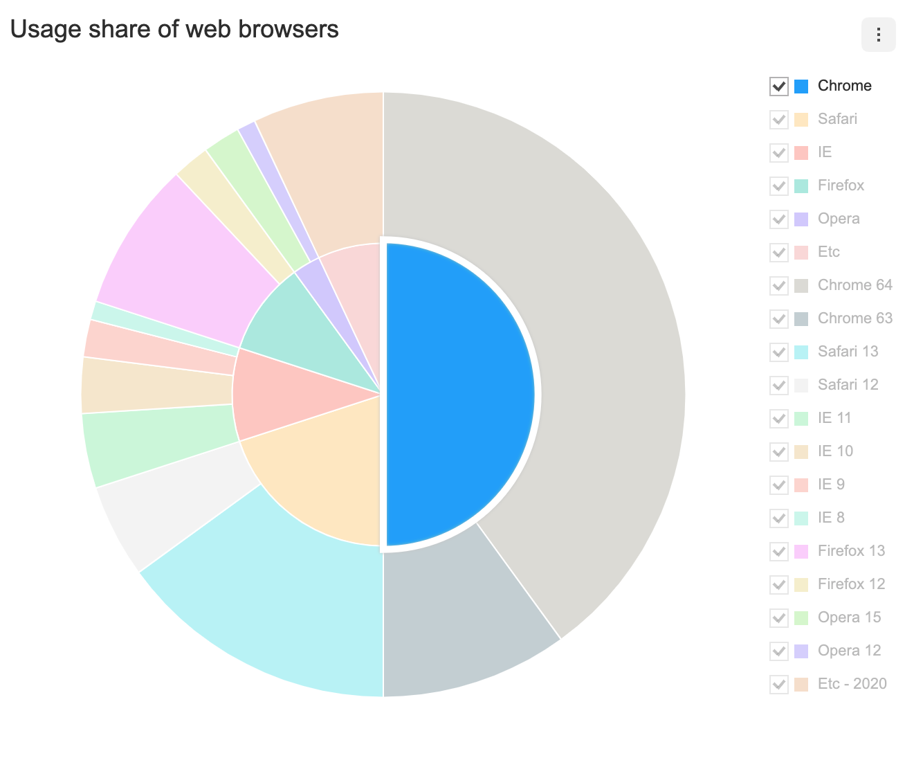
When a group data is selected, all series related with the same parentName is selected.
selectable option, accompanied by on API's selectSeries and unselectSeries, grants further control over the series.
Determines the direction in which the series is painted. As default, the series is painted in the clockwise direction and when it is set to false, the series will be painted in the counterclockwise direction.
- default:
true
const options = {
  series: {
    clockwise: false
  }
};
This option can be assigned to the name of each series. The example below makes the Pie chart that has a name 'browsers' to be printed in the clockwise direction while making the Pie chart that has a name versions to be printed in the counterclockwise direction.
const options = {
  series: {
    browsers: {
      clockwise: true
    },
    versions: {
      clockwise: false
    }
  }
};The radiusRange uses inner and outer options to define the radii of inner and outer circles. The default value for inner is 0. Using an inner value that is greater than 0 results in a donut shaped chart. This option can be assigned to the name of each series. If the series.radiusRange is not configured, the radii will be calculated to be the same.
| Property | Details |
|---|---|
radiusRange.inner |
Inner radius |
radiusRange.outer |
Outer radius |
When a radius is provided as a string containing the percent sign (%), the radius will be calculated to be the provided proportion.
const options = {
  series: {
    browsers: {
      radiusRange: {
        inner: '20%',
        outer: '50%'
      }
    },
    versions: {
      radiusRange: {
        inner: '55%',
        outer: '85%'
      }
    }
  }
};
When a numerical value is provided, the radius is calculated to be the absolute value of it.
const options = {
  series: {
    browsers: {
      radiusRange: {
        inner: 50,
        outer: 130
      },
    },
    versions: {
      radiusRange: {
        inner: 150,
        outer: 230
      }
    }
  }
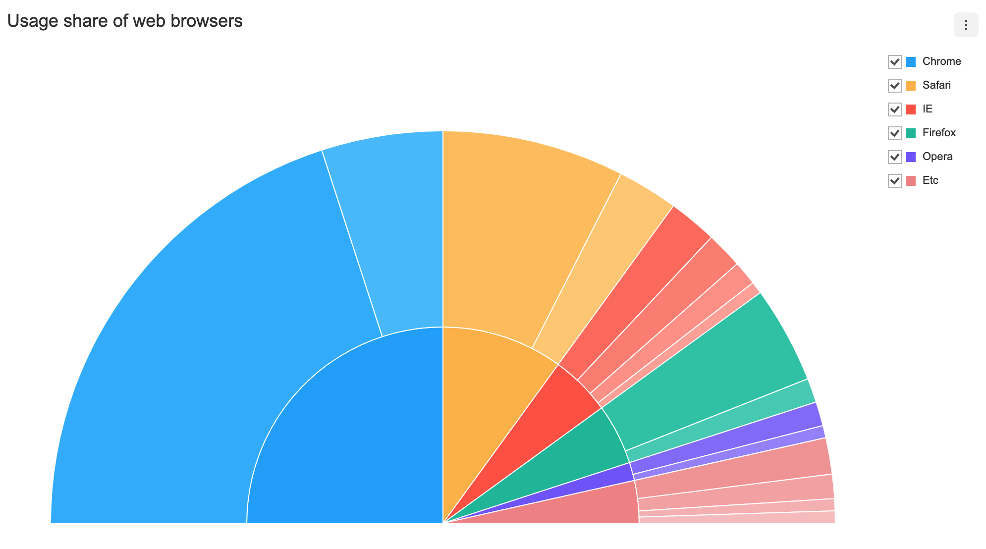
};The angleRange uses start and end options to determine the range of the arc.
| Property | Details |
|---|---|
angleRange.start |
Arc's starting angle (default: 0) |
angleRange.end |
Arc's ending angle (default: 360) |
const options = {
  series: {
    angleRange: {
      start: -90,
      end: 90
    }
  }
};
This option can be assigned to the name of each series.
const options = {
  series: {
    browsers: {
      angleRange: {
        start: 0,
        end: 180
      }
    },
    versions: {
      angleRange: {
        start: 180,
        end: 360
      }
    }
  }
};The series.dataLabels option can be used to display the data labels for all Nested Pie charts.
const options = {
  ...
  series: {
    dataLabels: {
      visible: true;
    }
  }
};
Each series option can have its own Pie series options, hierarchically, and options related to data labels can be defined in greater detail.
type options = {
  ...
  series?: {
    [name]: {
      ...
      dataLabels: {
        // Data label options for the Pie series
      };
    },
    ...
  };
};
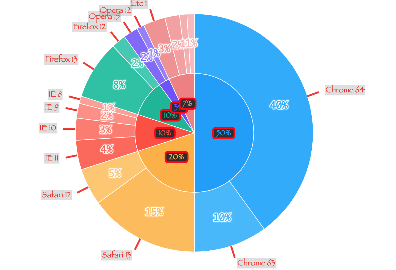
For example, the following code displays the data label for the browsers Pie series and the data label as well as the series name for the versions Pie series.
const options = {
  series: {
    browsers: {
      radiusRange: {
        inner: '20%',
        outer: '50%'
      },
      dataLabels: {
        visible: true,
        pieSeriesName: {
          visible: false
        }
      }
    },
    versions: {
      radiusRange: {
        inner: '55%',
        outer: '85%'
      },
      dataLabels: {
        visible: true,
        pieSeriesName: {
          visible: true,
          anchor: 'outer'
        }
      }
    }
  }
};The following is a list of themes that can be modified in the Nested Pie chart. Specifying the data label styles for each Pie series must be done through defining the series[name].dataLabels.
interface NestedPieChartSeriesTheme {
  colors?: string[];
  areaOpacity?: number;
  lineWidth?: number;
  strokeStyle?: string;
  hover?: {
    color?: string;
    lineWidth?: number;
    strokeStyle?: string;
    shadowColor?: string;
    shadowBlur?: number;
    shadowOffsetX?: number;
    shadowOffsetY?: number;
  };
  select?: {
    color?: string;
    lineWidth?: number;
    strokeStyle?: string;
    shadowColor?: string;
    shadowBlur?: number;
    shadowOffsetX?: number;
    shadowOffsetY?: number;
    restSeries?: {
      areaOpacity?: number;
    };
    areaOpacity?: number;
  };
  dataLabels?: CommonDataLabelBoxTheme & {
    pieSeriesName?: CommonDataLabelBoxTheme;
    callout?: {
      useSeriesColor?: boolean;
      lineWidth?: number;
      lineColor?: string;
    };
  };
}

type CommonDataLabelBoxTheme = {
  useSeriesColor?: boolean;
  lineWidth?: number;
  textStrokeColor?: string;
  shadowColor?: string;
  shadowBlur?: number;
  fontSize?: number;
  fontFamily?: string;
  fontWeight?: string | number;
  color?: string;
  textBubble?: {
    visible?: boolean;
    paddingX?: number;
    paddingY?: number;
    backgroundColor?: string;
    borderRadius?: number;
    borderColor?: string;
    borderWidth?: number;
    shadowColor?: string;
    shadowOffsetX?: number;
    shadowOffsetY?: number;
    shadowBlur?: number;
  };
};| Name | Type | Details |
|---|---|---|
colors |
string[] | Colors for the series |
areaOpacity |
number | Area opacity of the entire chart when all series have been activated |
lineWidth |
number | Series border width |
strokeStyle |
string | Series border color |
hover |
object | Style used when the cursor hovers over the series |
select |
object | Style used when series.selectable: true and a series is selected |
dataLabels |
object | Style for the data labels; identical to the theme.dataLabels option for the Pie chart |
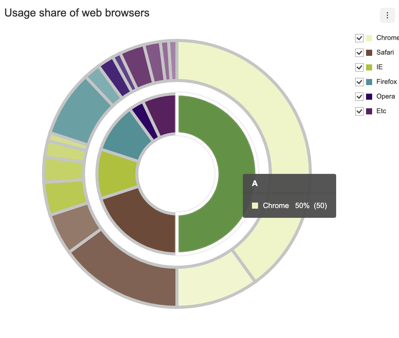
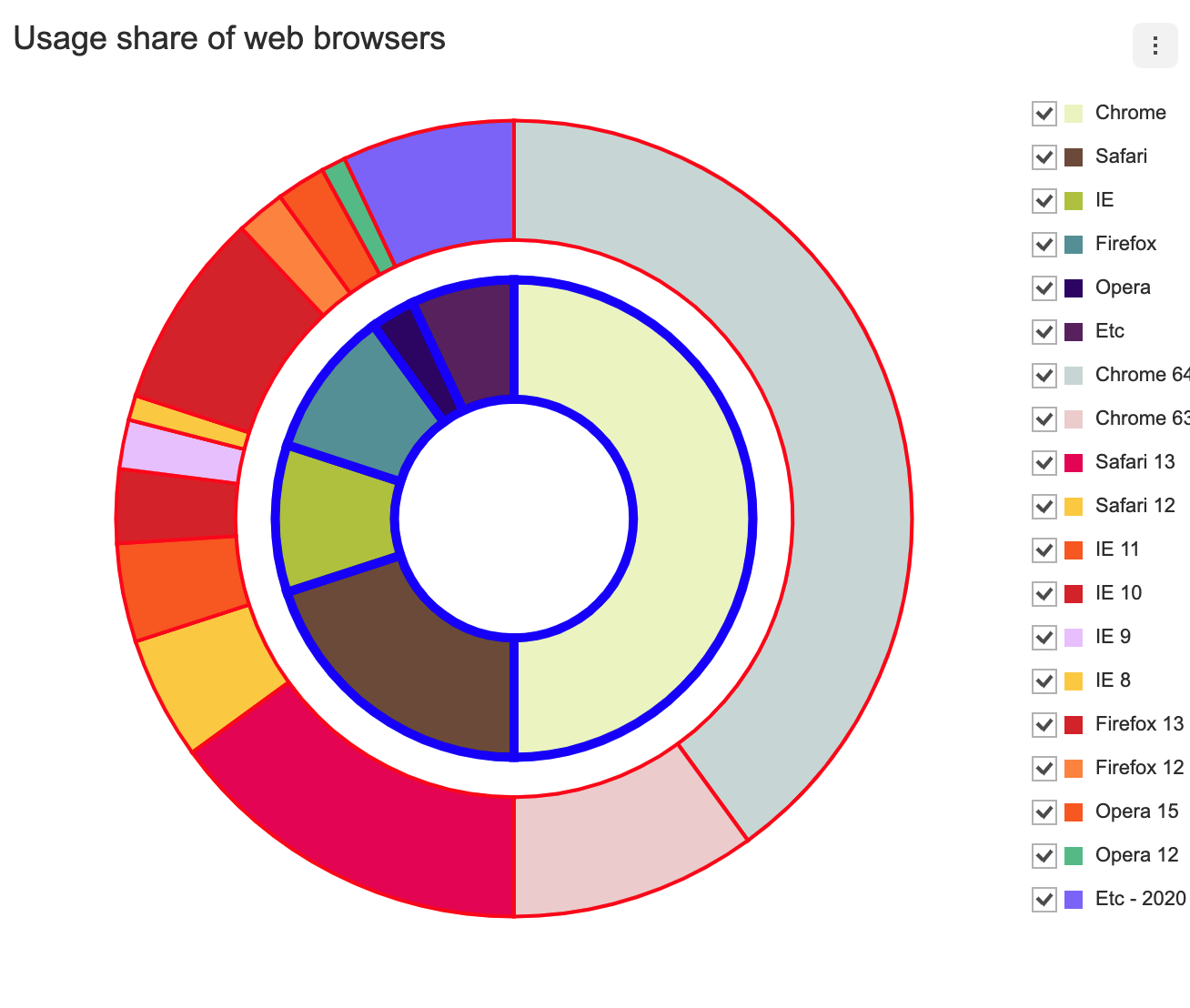
The theme is configured using the theme option, and the series theme is configured using the theme.series. Let's change the style for a series, with this simple example.
The following code uses lineWidth and strokeStyle to configure the series line width and color for all nested series.
const options = {
  theme: {
    series: {
      colors: ['#eef4c4', '#77543f', '#b7c72e', '#5b9aa0', '#30076f', '#622569', '#f75294'],
      lineWidth: 5,
      strokeStyle: '#cccccc',
    }
  }
}
The styles can be assigned to [name] of each series. To change the series color, border width, border color, and on-hover style, refer to the following code.
const options = {
  theme: {
    series: {
      browsers: {
        colors: ['#eef4c4', '#77543f', '#b7c72e', '#5b9aa0', '#30076f', '#622569'],
        lineWidth: 5,
        strokeStyle: '#0000ff',
        hover: {
          color: '#0000ff',
          lineWidth: 5,
          strokeStyle: '#000000',
          shadowColor: 'rgba(0, 0, 0, 0.5)',
          shadowBlur: 10
        },
      },
      versions: {
        colors: [
          '#cddbda',
          '#efd1d1',
          '#ea005e',
          '#fece2f',
          '#fc6104',
          '#dd2429',
          '#ebc7ff',
          '#fece2f',
          '#dd2429',
          '#ff8d3a',
          '#fc6104',
          '#5ac18e',
          '#8570ff'
        ],
        lineWidth: 2,
        strokeStyle: '#ff0000',
        hover: {
          color: '#ff0000',
          lineWidth: 2,
          strokeStyle: '#000000',
          shadowColor: 'rgba(0, 0, 0, 0.5)',
          shadowBlur: 10
        }
      }
    }
  }
};
The label style can be assigned to the [name] of each series. The following code applies a theme that affects the font and the text bubble.
const options = {
  series: {
    browsers: {
      dataLabels: {
        visible: true
      }
    },
    versions: {
      dataLabels: {
        visible: true,
        pieSeriesName: { visible: true, anchor: 'outer' }
      }
    }
  },
  theme: {
    series: {
      browsers: {
        dataLabels: {
          fontFamily: 'fantasy',
          fontSize: 13,
          useSeriesColor: true,
          textBubble: {
            visible: true,
            backgroundColor: '#333333',
            borderRadius: 5,
            borderColor: '#ff0000',
            borderWidth: 3,
            shadowOffsetX: 0,
            shadowOffsetY: 0,
            shadowBlur: 0,
            shadowColor: 'rgba(0, 0, 0, 0)',
          },
        },
      },
      versions: {
        dataLabels: {
          fontFamily: 'monaco',
          useSeriesColor: true,
          lineWidth: 2,
          textStrokeColor: '#ffffff',
          shadowColor: '#ffffff',
          shadowBlur: 4,
          callout: {
            lineWidth: 3,
            lineColor: '#f44336',
            useSeriesColor: false
          },
          pieSeriesName: {
            useSeriesColor: false,
            color: '#f44336',
            fontFamily: 'fantasy',
            fontSize: 13,
            textBubble: {
              visible: true,
              paddingX: 1,
              paddingY: 1,
              backgroundColor: 'rgba(158, 158, 158, 0.3)',
              shadowOffsetX: 0,
              shadowOffsetY: 0,
              shadowBlur: 0,
              shadowColor: 'rgba(0, 0, 0, 0)'
            }
          }
        }
      }
    }
  }
};