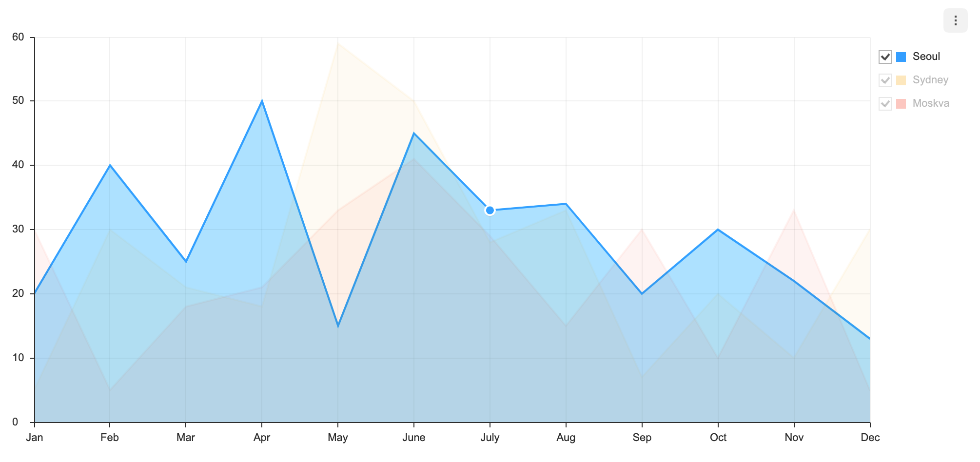
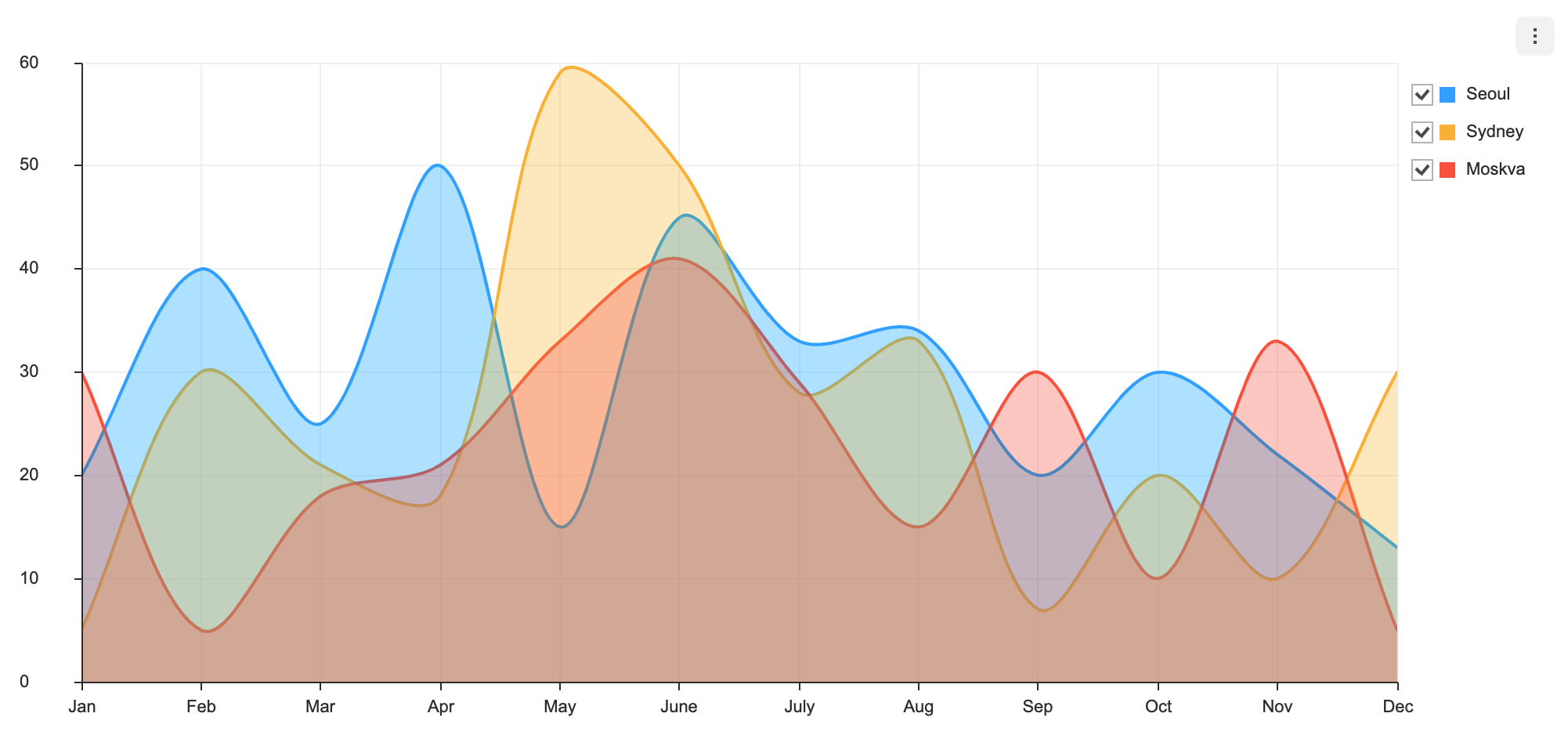
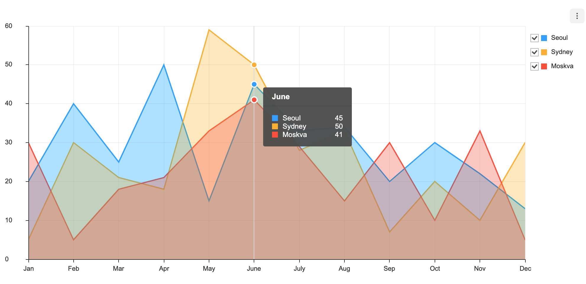
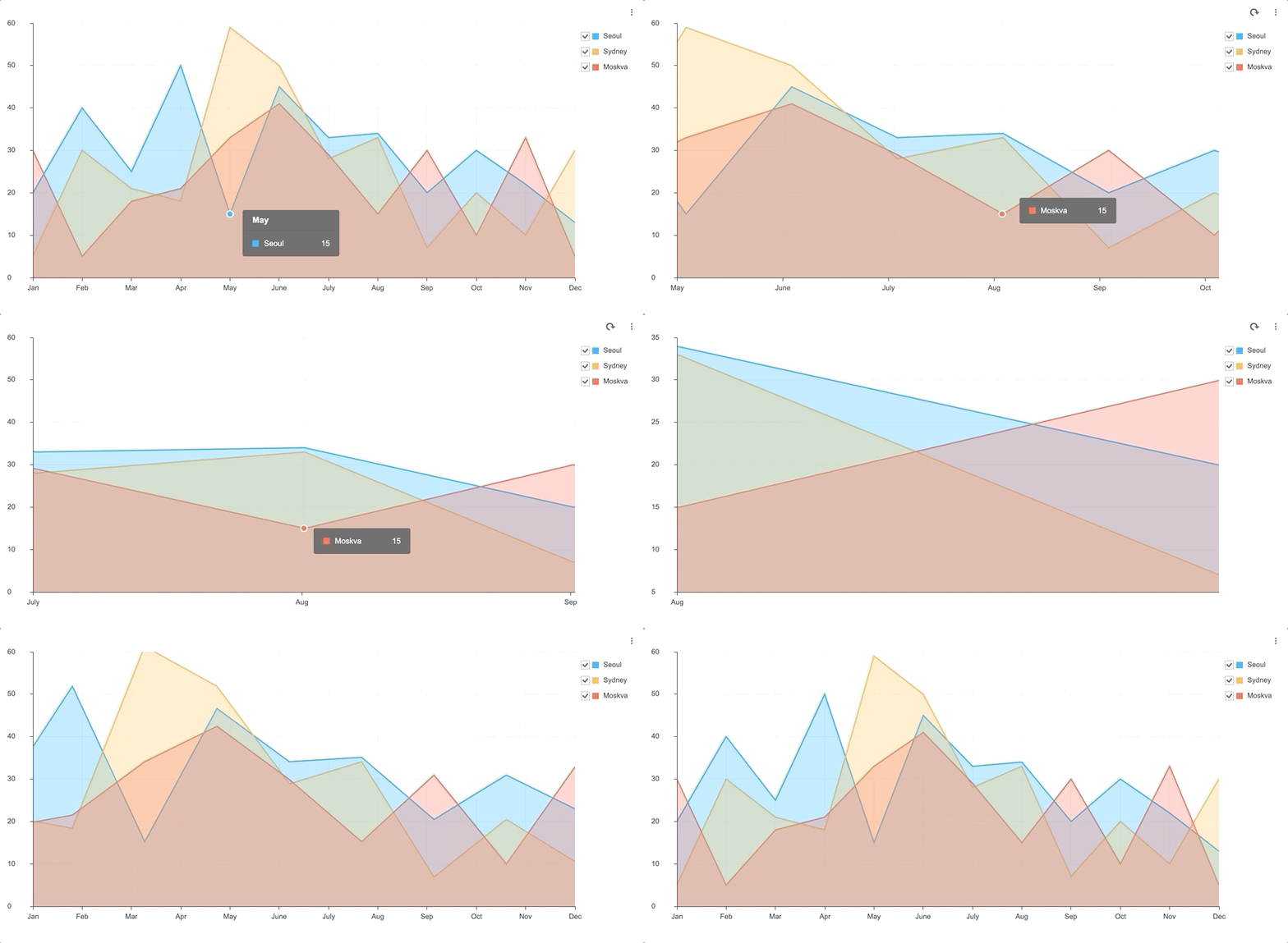
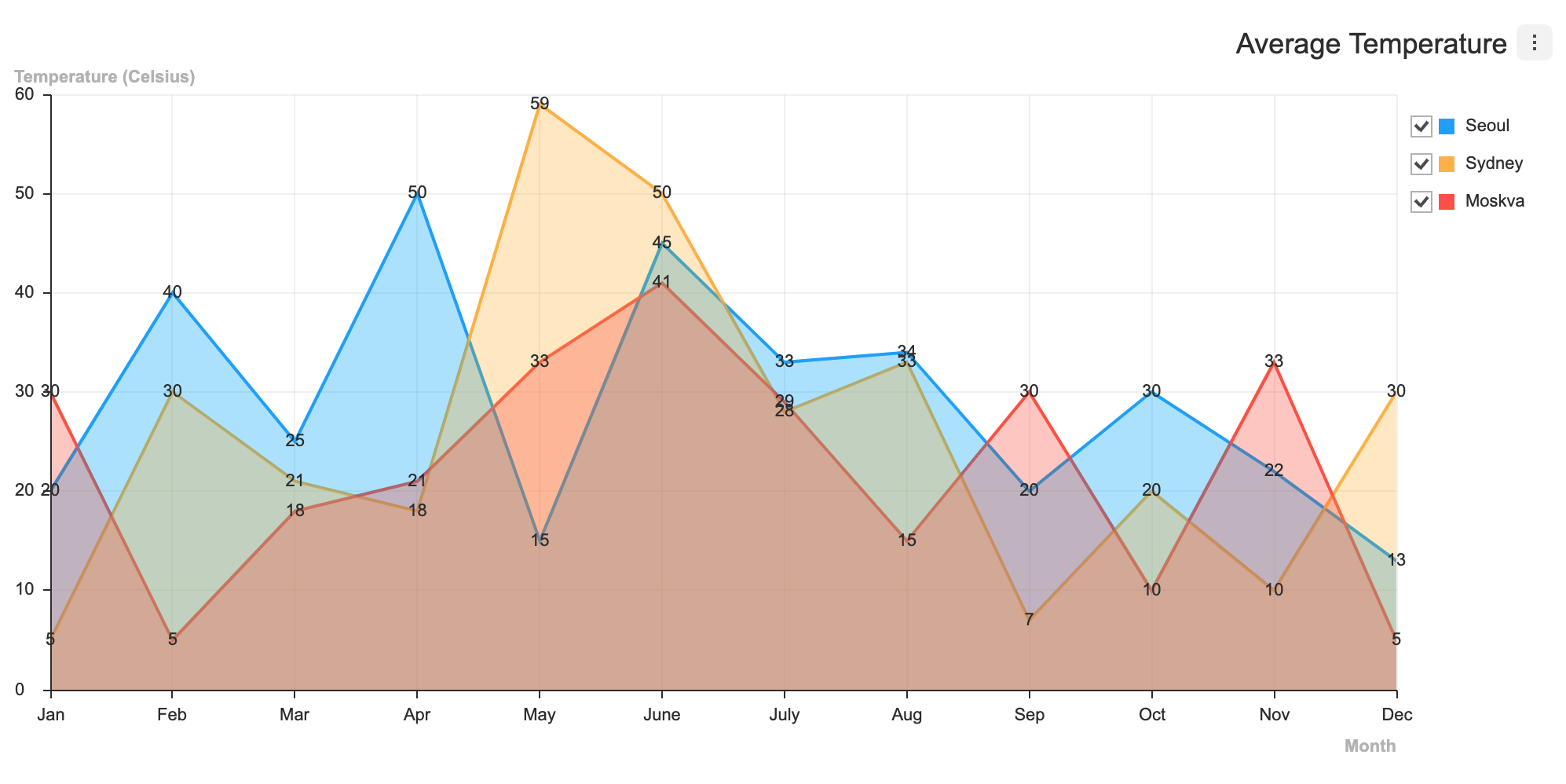
API information regarding each chart is not addressed in this document. Refer to the API Guide.
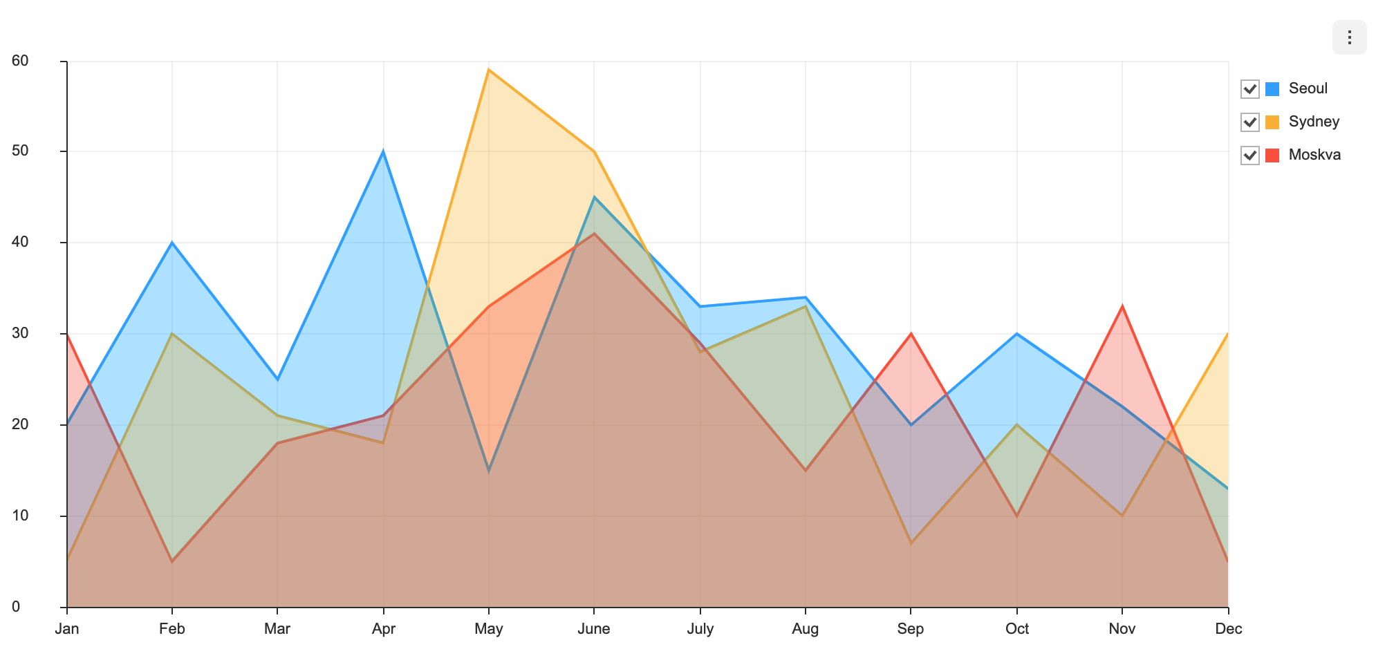
There are two different ways to create the Area chart. The Area chart can be created through the constructor function or the static function. The two methods both result in returning an instance of the chart. The HTML element in which the chart is drawn el, data data, and the options object options are taken as parameters. If the element in which the chart is drawn contains elements other than the chart itself, it may unintentionally affect the chart. Therefore, it is recommended that you use an empty HTML element.
import { AreaChart } from '@toast-ui/chart';

const chart = new AreaChart({el, data, options});

// or

import Chart from '@toast-ui/chart';

const chart = Chart.AreaChart({el, data, options});categories values are shown on the x-axis, and the series value must be completed with the name and the data. The name is used to identify each series and its id must be unique.
const data = {
  categories: [
    'Jan',
    'Feb',
    'Mar',
    'Apr',
    'May',
    'June',
    'July',
    'Aug',
    'Sep',
    'Oct',
    'Nov',
    'Dec',
  ],
  series: [
    {
      name: 'Seoul',
      data: [20, 40, 25, 50, 15, 45, 33, 34, 20, 30, 22, 13],
    },
    {
      name: 'Sydney',
      data: [5, 30, 21, 18, 59, 50, 28, 33, 7, 20, 10, 30],
    },
    {
      name: 'Moskva',
      data: [30, 5, 18, 21, 33, 41, 29, 15, 30, 10, 33, 5],
    },
  ],
}The main difference between the range chart and the basic chart is the type of the series data. The data must be entered as an array, and the starting value and the ending value must be entered according to the numerical order.
const data = {
  categories: [
    'Jan',
    'Feb',
    'Mar',
    'Apr',
    'May',
    'June',
    'July',
    'Aug',
    'Sep',
    'Oct',
    'Nov',
    'Dec',
  ],
  series: [
    {
      name: 'Seoul',
      data: [
        [-8.3, 0.3],
        [-5.8, 3.1],
        [-0.6, 9.1],
        [5.8, 16.9],
        [11.5, 22.6],
        [16.6, 26.6],
        [21.2, 28.8],
        [21.8, 30.0],
        [15.8, 25.6],
        [8.3, 19.6],
        [1.4, 11.1],
        [-5.2, 3.2],
      ],
    },
  ],
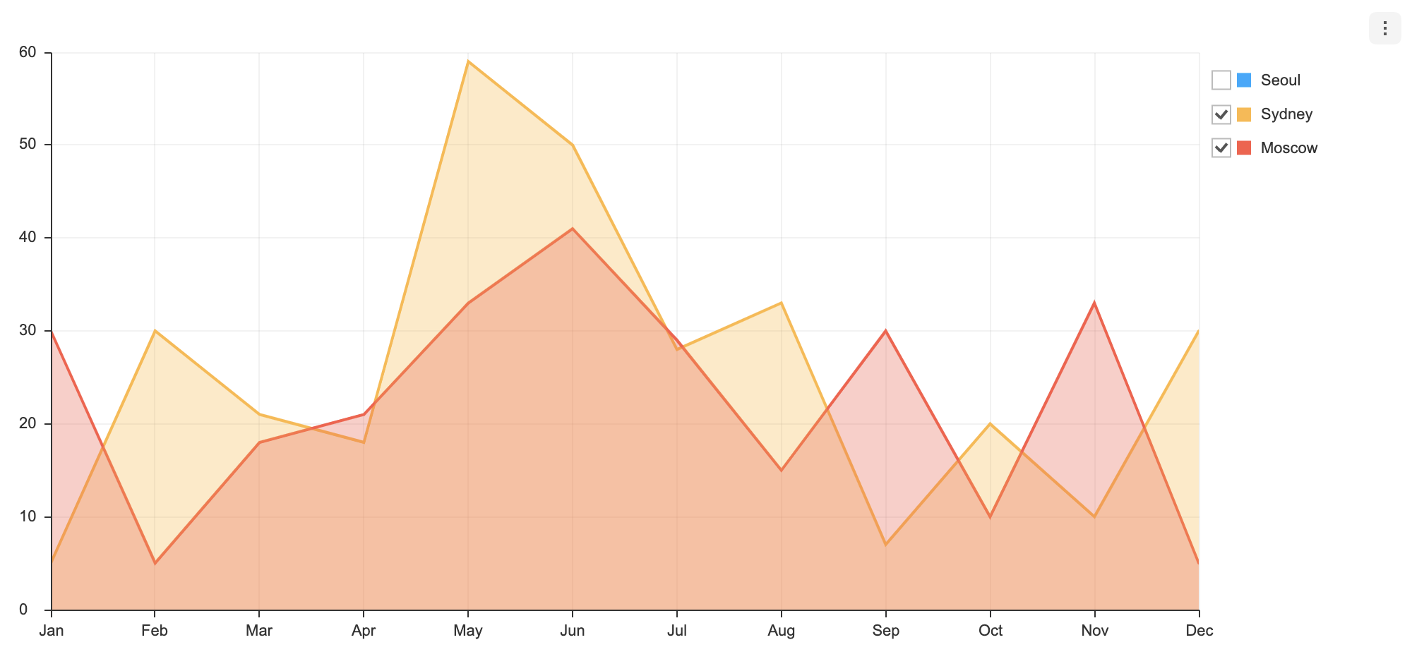
}Each series can have visible option. The visible option determines whether the series is displayed when the chart is first drawn. The default is true.
Both basic chart and range chart use the same way.
const data = {
  categories: [
    'Jan',
    'Feb',
    'Mar',
    'Apr',
    'May',
    'Jun',
    'Jul',
    'Aug',
    'Sep',
    'Oct',
    'Nov',
    'Dec',
  ],
  series: [
    {
      name: 'Seoul',
      data: [20, 40, 25, 50, 15, 45, 33, 34, 20, 30, 22, 13],
      visible: false,
    },
    {
      name: 'Sydney',
      data: [5, 30, 21, 18, 59, 50, 28, 33, 7, 20, 10, 30],
    },
    {
      name: 'Moscow',
      data: [30, 5, 18, 21, 33, 41, 29, 15, 30, 10, 33, 5],
    },
  ],
}
If you create a chart by applying the above option, you can see that the checkbox is unchecked.
options should be used as an object.
type options = {
  chart?: {
    // ...
  },
  xAxis?: {
    // ...
  },
  yAxis?: {
    // ...
  },
  legend?: {
    // ...
  },
  exportMenu?: {
    // ...
  },
  tooltip?: {
    // ...
  },
  plot?: {
    // ...
  },
  responsive?: {
    // ...
  },
  theme?: {
    // More explanations in the `theme` chapter.
  },
  series?: {
    showDot?: boolean;
    spline?: boolean;
    zoomable?: boolean;
    eventDetectType?: 'near' | 'nearest' | 'grouped';
    shift?: boolean;
    stack?: boolean | {
      type: 'normal' | 'percent';
    }
    dataLabels?: {
      visible?: boolean;
      anchor?: 'center' | 'start' | 'end' | 'auto' | 'outer';
      offsetX?: number;
      offsetY?: number;
      formatter?: (value) => string;
    }
  }
};
Common options that can be used with this chart are not addressed in this document. Refer to the respective options guide. (Links:
chartOptions, Axis, Legend, Export, Tooltip, Plot,responsiveOptions, Live Update )
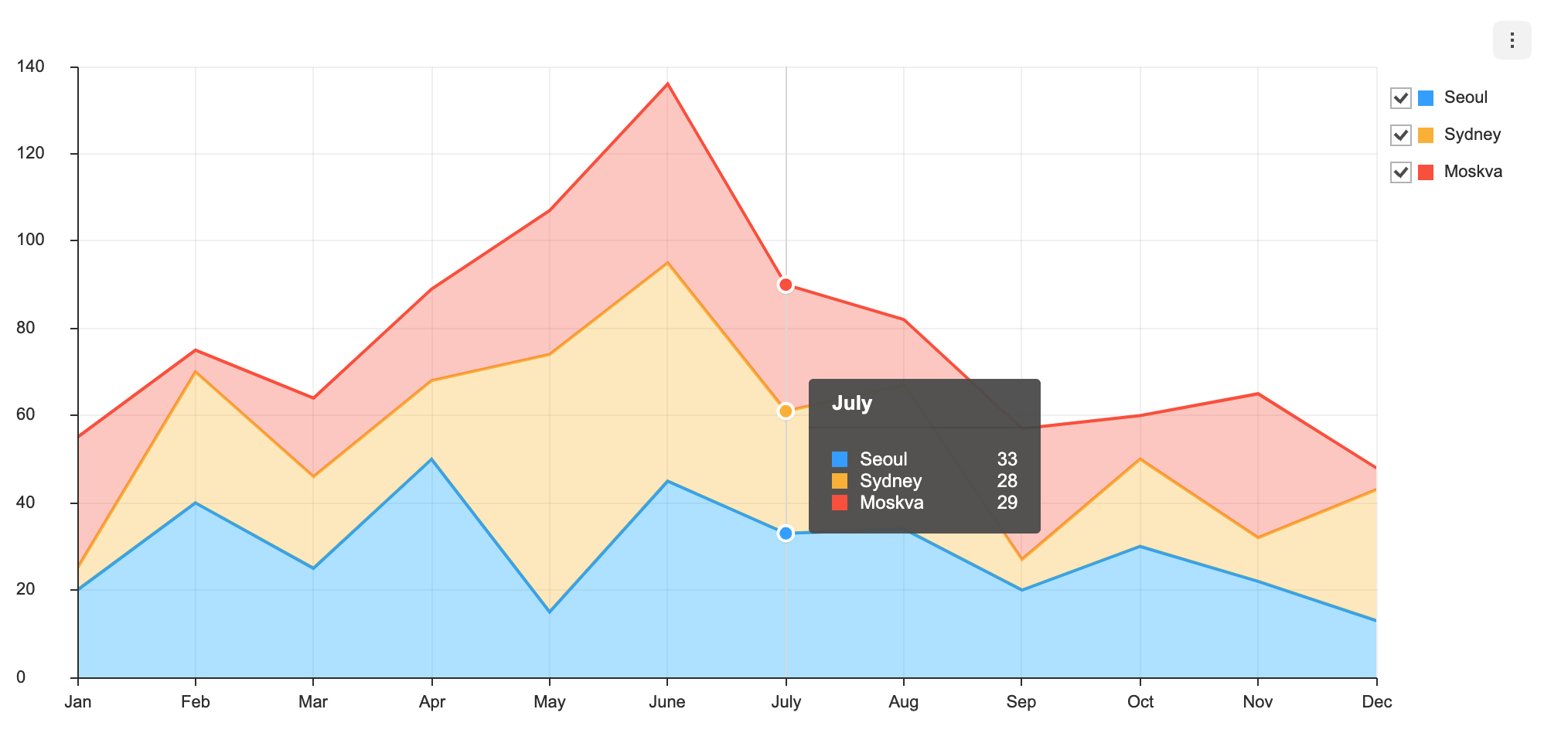
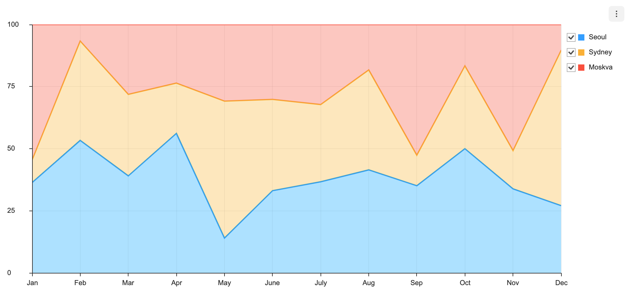
The stack option can be used to combine multiple series to form a stack chart. There are two types of stack charts: normal type and the percent type.
const options = {
  series: {
    stack: {
      type: 'normal'
    }
  }
}const options = {
series: {
stack: {
type: 'percent'
}
}
}- default:
false
Makes the series selectable.
const options = {
  series: {
    selectable: true
  }
};
selectable option, accompanied by on API's selectSeries and unselectSeries, grants further control over the series.
- default:
false
Fits the series into a smooth spline curve.
const options = {
  series: {
    spline: true
  }
}- default:
nearest
Defines ways to detect the data to be displayed on the tool tip.
| Type | Details |
|---|---|
near |
Detects the data when it is within a specified range of the mouse. If there are more than one data sets within a specified range, they are all detected. |
nearest |
Event is detected within the entire area of the chart. Only the series that is closest to the mouse is detected. |
grouped |
All data that are equal with respect to the x-axis are detected. |
point |
Detected when hovering over the series data point area. |
const options = {
  series: {
    eventDetectType: 'grouped'
  }
};- default:
false
zoomable can be used to zoom into the chart.
const options = {
  series: {
    zoomable: true
  }
}Data labels display information regarding the series on the chart.
The following are the options for dataLabels.
type options = {
  ...
  series?: {
    dataLabels?: {
      visible?: boolean;
      offsetX?: number;
      offsetY?: number;
      formatter?: (value) => string;
    }
  }
};| Name | Type | Details |
|---|---|---|
visible |
boolean | Whether to make the data label visible |
offsetX |
number | X offset of the data label position |
offsetY |
number | Y offset of the data label position |
formatter |
function | Takes the value of the data as its parameter and defines the format to be displayed |
// basic
const options = {
  series: {
    dataLabels: { visible: true }
  }
};The following is a list of themes that can be modified in the Area chart.
interface AreaChartSeriesTheme {
  lineWidth?: number;
  areaOpacity?: number;
  dashSegments?: number[];
  colors?: string[];
  dot?: {
    radius?: number;
    borderColor?: string;
    borderWidth?: number;
  };
  select?: {
    dot?: {
      color?: string;
      radius?: number;
      borderColor?: string;
      borderWidth?: number;
    };
    areaOpacity?: number;
    restSeries?: {
      areaOpacity?: number;
    }
  };
  hover?: {
    dot?: {
      color?: string;
      radius?: number;
      borderColor?: string;
      borderWidth?: number;
    };
  };
  dataLabels?: {
    textBubble?: {
      visible?: boolean;
      arrow?: ArrowTheme;
      paddingX?: number;
      paddingY?: number;
      backgroundColor?: string;
      borderRadius?: number;
      borderColor?: string;
      borderWidth?: number;
      shadowColor?: string;
      shadowOffsetX?: number;
      shadowOffsetY?: number;
      shadowBlur?: number;
    }
    useSeriesColor?: boolean;
    lineWidth?: number;
    textStrokeColor?: string;
    shadowColor?: string;
    shadowBlur?: number;
    fontSize?: number;
    fontFamily?: string;
    fontWeight?: string | number;
    color?: string;
  };
}| Name | Type | Details |
|---|---|---|
lineWidth |
number | The width of the series line |
areaOpacity |
number | The opacity of the entire area when all series are active |
dashSegments |
number[] | The dashSegment value of the series line (IE11 or higher version supported) |
colors |
string[] | The color of the series |
dot |
object | The style for the dot displayed when showDot: true |
select |
object | The style that is applied to the line when the series is selected and the series.selectable is set to true. |
select.dot |
object | The style for the dot displayed when the data is selected |
select.areaOpacity |
number | The opacity of the selected series |
select.restSeries |
object | The opacity of the series that are not selected |
hover |
object | The style that is applied when the user hovers over the data |
dataLabels |
object | Style for the data labels |
dataLabels.useSeriesColor |
boolean | Whether to use the series colors for the data label texts |
dataLabels.lineWidth |
number | Text stroke width |
dataLabels.textStrokeColor |
string | Text stroke color |
dataLabels.shadowColor |
string | Text shadow color |
dataLabels.shadowBlur |
number | Text shadow blue |
dataLabels.fontSize |
number | Font size |
dataLabels.fontFamily |
string | Font name |
dataLabels.fontWeight |
string | Font weight |
dataLabels.color |
string | Text color; does not work when useSeriesColor: true |
dataLabels.textBubble |
object | Text bubble configurations |
dataLabels.textBubble.visible |
boolean | Whether to use the text bubble |
dataLabels.textBubble.paddingX |
number | Horizontal padding |
dataLabels.textBubble.paddingY |
number | Vertical padding |
dataLabels.textBubble.backgroundColor |
string | Text bubble background color |
dataLabels.textBubble.borderRadius |
number | Text bubble border radius |
dataLabels.textBubble.borderColor |
string | Text bubble border color |
dataLabels.textBubble.borderWidth |
number | Text bubble border width |
dataLabels.textBubble.shadowColor |
string | Text bubble shadow color |
dataLabels.textBubble.shadowOffsetX |
number | Text bubble shadow x offset |
dataLabels.textBubble.shadowOffsetY |
number | Text bubble shadow y offset |
dataLabels.textBubble.shadowBlur |
number | Text bubble shadow blur |
dataLabels.textBubble.arrow |
object | Text bubble arrow configurations |
dataLabels.textBubble.arrow.visible |
boolean | Whether to use the text bubble arrows |
dataLabels.textBubble.arrow.width |
number | Arrow base width |
dataLabels.textBubble.arrow.height |
number | Arrow height |
dataLabels.textBubble.arrow.direction |
'top' | 'right' | 'bottom' | 'left' | Arrow direction |
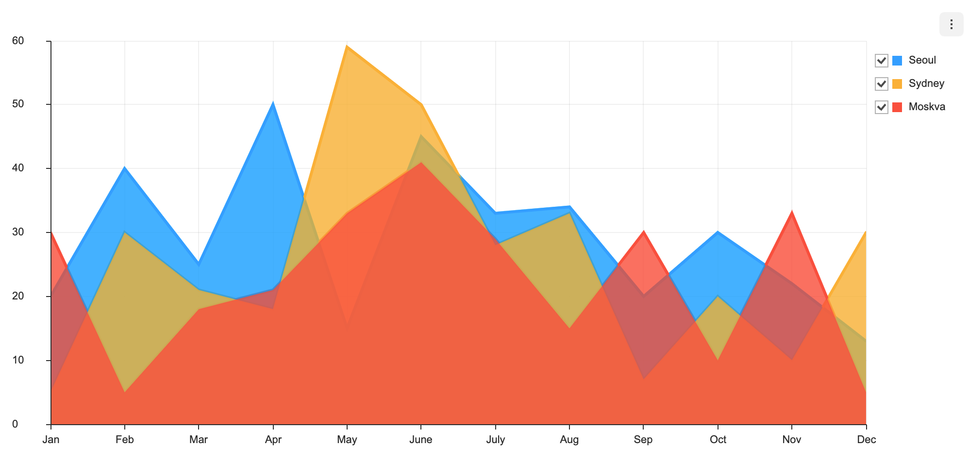
The theme can be added through the theme value in the options object. For example, let's change the opacity and the line width of a series area.
const options = {
  theme: {
    series: {
      areaOpacity: 0.8,
      lineWidth: 3,
    }
  }
};
The result of the above option is shown as shown below.
The code below applies a theme to the data label to use text bubbles and to change the text styles.
const options = {
  series: {
    dataLabels: { visible: true, offsetY: -10 }
  },
  theme: {
    series: {
      dataLabels: {
        fontFamily: 'monaco',
        fontSize: 10,
        fontWeight: 300,
        useSeriesColor: true,
        textBubble: {
          visible: true,
          arrow: {
            visible: true,
            width: 5,
            height: 5,
            direction: 'bottom'
          }
        }
      }
    }
  }
};